Tuesday, 9 May 2017
Friday, 5 May 2017
Thursday, 4 May 2017
Thursday, 27 April 2017
Tuesday, 25 April 2017
Sunday, 23 April 2017
What have you learnt about technologies from the process of constructing this product?
What have you learnt about technologies from the process of constructing this product?
During the course of this main task project, I have expanded and built upon skills I learnt during the preliminary task. In the preliminary task I used Adobe InDesign for the first time, and now in the main task I have continued to use it and develop my skills on it.
As the main task has to be more professional, I have had to perfect my skills on InDesign in order to make the magazine pages look as though they belong in an actual, genuine magazine. I also adapted the skills I already have in Adobe Photoshop CS6. In order to get my magazine images to professional standards, I applied levels to the photographs to increase the contrasts and overall image quality. Then I used the lasso tool to cut out the image of my main model, as I didn't want him on the fence background. This was a challenge, as it was something I hadn't done in detail to this degree before. It took me many attempts, however I eventually got there with a good finished edit.
The advantages of using Photoshop is that it is the most advanced photo editing software on the internet, therefore it is the best choice for editing and cropping images like I have here. When editing my images I applied adjustments such as curves and levels in order to bring out the contrast which in turn gives them a better quality, and in essence a more professional quality. The disadvantage is that the lasso tool is very precise and intricate, meaning it is very easy to make a mistake and have to start again, which is what happened to me multiple times in the process of trying to crop out this model from the background.

In terms of InDesign, I have used it to make my work more professional, compared to how professional it looked in the preliminary task. The advantage of InDesign is that it is professional, and it t is what all the professional magazine editors use to compile the content when constructing their magazine pages, therefore it was the perfect choice for me. However, the disadvantage is that I am still not 100% skilled in InDesign, meaning I have spent lots of times undoing and reviewing work that I have gotten wrong as a result of not doing it right the first time, simply because I do not have much experience in it.
The advantages of using slideshare and prezi is that they are more exciting ways of getting my content onto the blog, without the need for just basic blog entries. The disadvantage however is that these are put online for anyone to see, which means there is potential for someone else to copy and plagiarise my work, in turn infringing copyright.
Thursday, 20 April 2017
Sunday, 16 April 2017
Thursday, 13 April 2017

Tuesday, 11 April 2017
How did you attract / address your audience?
In order to answer this question, I will produce annotations of each page I created (Front page, contents page and double page spread) on different blog posts. In order to make it more creative and more interesting, I will create each one on Microsoft powerpoint, and embed it into the blog via slideshare.
Wednesday, 5 April 2017
Who would be the audience for your media product?
As previously stated in my coursework blog, my target audience are 15-30 year olds, interested in Rock n Roll and pop music (because this magazine is based around Pop and Rock), liking bands such as the Beatles and Coldplay. They would read the magazine because it makes them happy that they have learnt something new about pop rock and the people within the community. It also shows they enjoy reading about the latest news regarding pop rock music, that they are interested in this genre. They read it to keep up to date with the latest goings on of the rock and pop community.
This is further outlined in my brand eye research task, which I created in the research and planning stage of my main task. I created this to understand more the type of people that would read my magazine; my target audience.

As well as a brand eye, I also created a target audience analysis to pinpoint exactly who I aimed my magazine towards. I believe I have tailored this magazine towards my target audience, and this will be further explained in detailed annotation on the upcoming evaluation blog posts.
In my target audience analysis I detailed such things as the clothes they would wear, which in this case would be mainstreamed clothes, seeing as pop rock is somewhat seen as a mainstream music genre, the type of genre everybody listens to, without much defined, eccentric culture to support it. Therefore the types of clothes they would wear are items such as shirt and jeans, just typical everyday wear. Seeing as the target audience are 15-30 I presumed that the majority of the audience would not be in a position of seniority or management yet, therefore they have more low level jobs such as retail.

This is further outlined in my brand eye research task, which I created in the research and planning stage of my main task. I created this to understand more the type of people that would read my magazine; my target audience.
As well as a brand eye, I also created a target audience analysis to pinpoint exactly who I aimed my magazine towards. I believe I have tailored this magazine towards my target audience, and this will be further explained in detailed annotation on the upcoming evaluation blog posts.
In my target audience analysis I detailed such things as the clothes they would wear, which in this case would be mainstreamed clothes, seeing as pop rock is somewhat seen as a mainstream music genre, the type of genre everybody listens to, without much defined, eccentric culture to support it. Therefore the types of clothes they would wear are items such as shirt and jeans, just typical everyday wear. Seeing as the target audience are 15-30 I presumed that the majority of the audience would not be in a position of seniority or management yet, therefore they have more low level jobs such as retail.

Friday, 31 March 2017
Evaluation
I will begin to evaluate my main task over the coming days and weeks to round off my project so far.
The questions that I will be answering and discussing include;
The questions that I will be answering and discussing include;
- In what ways does your media product use, develop or challenge forms and conventions of real media products?
- How does your media product represent particular social groups?
- What kind of media institution might distribute your media product and why?
- Who would be the audience for your media product?
- How did you attract / address your audience?
- What have you learnt about technologies from the process of constructing this product?
- Looking back at your preliminary task, what do you feel you have learnt in the progression from it to the full product?
Sunday, 26 March 2017
Pictures used
This is a contact sheet made up of all the pictures I shot that I would use for my contents page.


Friday, 24 March 2017


Thursday, 23 March 2017
House style for Anthem
I have decided that my colour scheme will be red, black and white. The red has connotations of power, passion and courage. With my magazine I aim to express passion, in this case a passion for pop rock music. The red, black and white colour palette is reflective of Q magazine, which is known for its iconic red black and white colours used. Q is also a pop rock music magazine, therefore this shows that this colour scheme will appeal to the pop rock target audience, as I know that Q is successful.
I will not have a logo as such, but instead a powerful and iconic "ANTHEM" masthead in either red or white text, the font of which will be Haettenschweiler as that is a powerful and dominant font style which is helpful as I am aiming to convey power with my magazine, as the people reading it will want to achieve some sort of power within their lives.
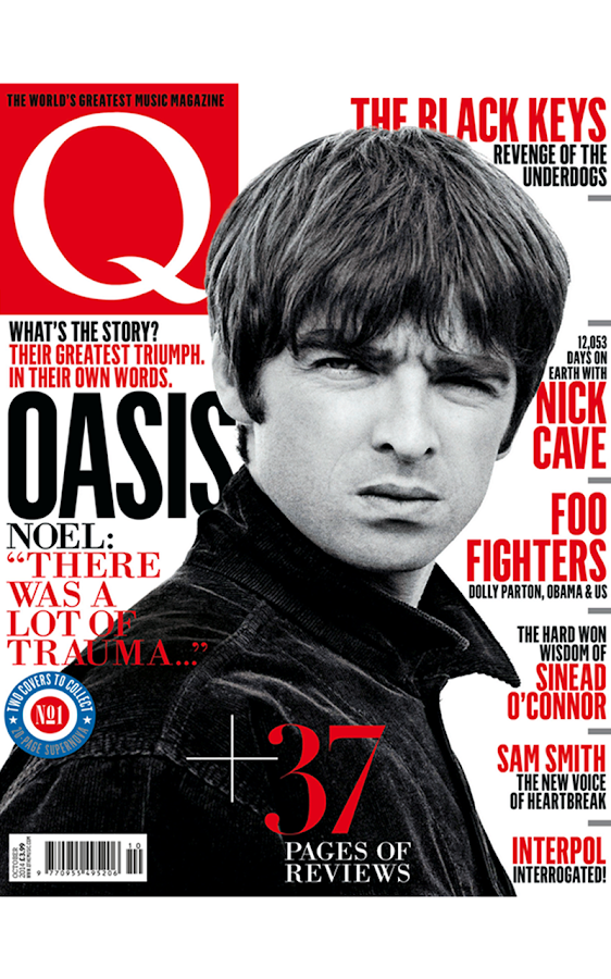
The location of the barcode, issue date and issue number will be found on the bottom right of the page because that is where it is conventionally found, such as on this magazine :

Tuesday, 21 March 2017
Contents Page Design
I am currently designing my contents page, and I want it to contain a line at the top with the name of my magazine, Anthem, to feature somewhere along the line. This is to take inspiration from this magazine:

Here is the first design of the line at the top,


Here is the first design of the line at the top,

However, I have decided to use this line and masthead combo as the red stands out more.

Thursday, 16 March 2017
Magazine Name
I have decided to name my magazine: ANTHEM .
This is because anthem is synonymous with music, and my magazine is a music magazine. More specifically my magazine is based on pop rock music, and anthems are common with rock songs and concerts. Anthems are used in big stadiums and venues in rock concerts or sports games, and they are powerful. Everyone joins into the anthems and chants together which creates a sense of community and togetherness. This is what I am attempting to create with my magazine, a powerful sense of community, which brings all the fans of pop music and rock music, together.
This is because anthem is synonymous with music, and my magazine is a music magazine. More specifically my magazine is based on pop rock music, and anthems are common with rock songs and concerts. Anthems are used in big stadiums and venues in rock concerts or sports games, and they are powerful. Everyone joins into the anthems and chants together which creates a sense of community and togetherness. This is what I am attempting to create with my magazine, a powerful sense of community, which brings all the fans of pop music and rock music, together.
Tuesday, 14 March 2017
Front cover decisions

This front cover has anthem in red which is conventional in pop rock magazines, as red has connotations of passion, anger etc. The masthead is pushed to the upper left hand side because that is where mastheads are conventionally found on magazine covers, and this is a good place to put it as it is where the human eye is naturally drawn to.

However, this is the front page I will be going with because it subverts typical front page stereotypes. This sets the tone of the magazine, that it is different and doesn't follow the crowd, which is something that my target audience will aspire to do. The white masthead stands out more than the red one which draws the eye to the page more than the red does. The image is pushed over to the left which makes it more interesting to look at, and holds the audience's attention for longer than it would have been has it been centred like in the first picture.
Sunday, 12 March 2017

My Pop Rock magazine Target Audience Analysis
Audience Profile
Gender : Unisex
Age : 15-30 year olds
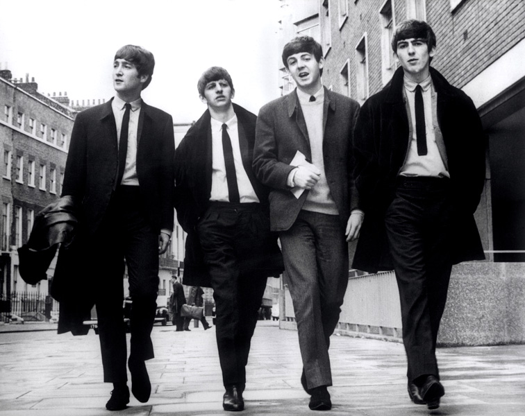
Clothes they wear : Pop Rock isn't as expressive a genre as say punk rock or indie music, therefore the clothes are average and somewhat mainstream, such as t shirts and jeans. The model on the front cover is wearing a shirt and tie to reflect the older pop rock era such as the Beatles. The fact that the shirt has a tie and is done all the way up conveys eloquence and a smart vibe. However the shirt is untucked which also shows a rebellious side, and that not everything is as it seems which is synonymous with pop rock music. Pop rock is the balance between the jovial innocence of pop and the rebellious extroversion of rock music.
Jobs they have : Seeing as the target age demographic is 15-30, a small percentage will be 15-18 and may be in full time education, therefore they may have part time jobs such as retail or stock room. The majority of the target audience however are over 18 and therefore presumably in a job full time, and seeing as this genre is somewhat mainstream and not niche, the audience will have normal, average jobs such as teachers, nurses, retail workers etc.
Market Segmentation
Demographic : The age range is 15-30 therefore they are of a young age and will presumably have busy, time consuming social lives. This means that this magazine will be read when they are enjoying a brief stint of free time within their hectic timetable.
Geographic : Due to the audience not being niche and alternative (which would suggest a catchment area of trendy locations such as Camden, Shoreditch, and Hackney) the areas in which they live will be average and normal such as Manchester, London, Birmingham, Newcastle etc. The mainstreamed genre is the most played on modern radio, therefore there will be an abundance of fans in every city or town in the UK.
Psychographic : These audience members will presumably be avid clubbers and drinkers due to their young age. However also because of their young age they may be somewhat tight with money as traditionally young people don't have lots of money as they have not been working as long as people 2-3 decades their senior.
Behavioristic : Mainstreamed audience that listen to pop rock music everyday. May also listen to other genres such as indie and punk. Want to be successful but in their own fields, not necessarily aiming to develop a fruitful career in the pop rock music industry.
Behavioristic : Mainstreamed audience that listen to pop rock music everyday. May also listen to other genres such as indie and punk. Want to be successful but in their own fields, not necessarily aiming to develop a fruitful career in the pop rock music industry.
Saturday, 11 March 2017

Friday, 10 March 2017
Image Manipulation
In order to get my images ready for placing on the magazine document in InDesign, I have used photoshop to edit them. This involves cropping out the image of the model, as well as applying levels to adjust the exposure to an appropriate level.


Thursday, 2 March 2017
Ideas for photos
I have taken the main chunk of photos for my magazine, ones which will be featured on my front page and double page spread, therefore I still need some to be featured on my contents page. In order to relate to the genre, my images will have young people in typical young people clothes like jumpers and jeans, to show that they are young. However, I will have them wear smart clothes on top like suit jackets etc to show they are also involved with Rock n Roll / Pop music.
Tuesday, 21 February 2017
Pop Rock Research
In order to understand my genre more, which is pop rock, I must analyse a magazine that focuses purely on that genre, such as this:


This is the front cover for a pop rock magazine. The model, legendary guitarist Jimi Hendrix, is wearing a smart shirt and blazer. These are smart clothes and makes him look somewhat professional. This is what I was going for when I took photos of my model with a shirt and tie. In this image, Hendrix is in a suit with no tie and top button not done up, which shows he is smart but at the same time conveys his rugged, wild side. This is the same thing I did, as my model wore a shirt and tie but did not tuck in his shirt, which also shows he has a rugged, wild side to his character.
The masthead which says classic rock is covered by Hendrix' head which shows he is important and powerful. The masthead is red which has connotations of power and strength which reinforces the idea that he is a strong character.
Saturday, 18 February 2017


Thursday, 16 February 2017
My Photos

Here are the photos I have taken for my rock pop magazine. My model is in a white shirt and black tie because that is something typically worn by rock pop artists, in particular the Beatles:

Tuesday, 7 February 2017
Risk Assessment
Since I am taking my photos at home without supervision, I will need to compile a risk assessment to make sure I stay safe and minimise the risks that may occur as a result of shooting my photos.
The first risk is that I will walk into the road and therefore into oncoming traffic when shooting in the street. To minimise the chances of this happening I will make sure to look up and be careful whilst shooting photos on my camera.
Another risk is falling down whilst taking high angle shots of my model. In order to minimise this risk I will stand on a sturdy piece of furniture such as a chair.
Monday, 6 February 2017
Photography Plan / Synopsis
In order to make my magazine for the main task a step up in quality and detail from my preliminary task, I will take more professional photos. In my preliminary task I took photos on a whim because I had some free time and my friends were available. Some of them were even just images on my camera roll from months prior. However this time I will use a DSLR camera, in specifics the Nikon D3300, in order to have the best quality photos to use in my main task magazine product.
Seeing as my genre is Pop / Rock, I will have to interpret the rock genre and include that in my photographic Mise en Scene.
I will take photos this commencing week of a male teenager, my brother, to be specific. I will take the photos at home because I have a DSLR camera at home and I know how to use one efficiently, therefore I do not need the help of someone at college in the photography studio.
Because my genre is rock I will have my model standing with a vinyl record in one hand and a mobile phone in the other. This will be to signify the difference in music over the ages. The vinyl he will be holding will be of pop rock music, such as Bowie or the Beatles. I will turn the model into a rock & roll star, as that is what people will want to see on a front page of a magazine, a successful young singer that they can aspire to be. The story behind the images is that he is a famous, young rock singer that is talking to my magazine about the evolution of how people listen to pop rock music, hence why he is holding a vinyl and a mobile phone.
To show the genre of rock music I will incorporate a guitar into the shot. This is to show that it is a pop rock music magazine, as if it was a genre like techno or house, it would be a soundboard / keyboard. To reinforce the pop rock genre theme my model will wear clothing typically found in pop rock culture, such as the white shirt and black tie made famous by the Beatles:
Double page spread XXL analysis

Semiotic Analysis for XXL Double Page Spread
The main cvi of these pages are the two ladies pictured. They both show direct address, by staring straight into the camera, which shows rebellion and subverts dominant ideology that women are weak and powerless. This conveys a sense of power and pride, which creates a strong brand identity and appeals to women readers. Both females are also black which contradicts hegemonic values about race in modern day supposedly patriarchal society which some say favours white males, and here we have the binary opposite, two empowered black women.
The background colour is a solid white canvas which contrasts with the black text that lies upon it. The headlines are in red which have connotations of power, passion and strength, which reinforce the afore-mentioned ideals of the women being powerful and strong individuals. The red on the white show a contrast.
On the right hand page there is a pull quote at the top in black bold text which shows that it is important and needs to be seen. This shows that this is an important magazine and it appeals to its target audience as the boldness shows power and strength.
Sunday, 5 February 2017
My Own Magazine Decisions
For my own magazine, I have decided that I will base it around the music genre of Pop Rock. I have experience in understanding Rock music magazines, as I have analysed multiple aspects of UK Rock & Roll magazine such as it's target audience, front cover, contents page and double page spread. My survey results came back and Rock was voted once out of the 10 responses from my target audience. This shows that there is not a massive demand for rock magazines, however I know that there is a definite audience out there within my target audience demographic that will want one.
Therefore my magazine will be more alternative, such as the Louder Than War magazine. It will not be mainstream like the XXL magazine. My magazine will be aimed towards a niche, somewhat subjective audience that are very specific about their tastes, which in this case is rock music. Despite there not being a high demand for this genre, I will still include the codes and conventions of magazines that I have researched and analysed so far to show good knowledge of magazines.
Therefore my magazine will be more alternative, such as the Louder Than War magazine. It will not be mainstream like the XXL magazine. My magazine will be aimed towards a niche, somewhat subjective audience that are very specific about their tastes, which in this case is rock music. Despite there not being a high demand for this genre, I will still include the codes and conventions of magazines that I have researched and analysed so far to show good knowledge of magazines.
Subscribe to:
Comments (Atom)