I have decided that my colour scheme will be red, black and white. The red has connotations of power, passion and courage. With my magazine I aim to express passion, in this case a passion for pop rock music. The red, black and white colour palette is reflective of Q magazine, which is known for its iconic red black and white colours used. Q is also a pop rock music magazine, therefore this shows that this colour scheme will appeal to the pop rock target audience, as I know that Q is successful.
I will not have a logo as such, but instead a powerful and iconic "ANTHEM" masthead in either red or white text, the font of which will be Haettenschweiler as that is a powerful and dominant font style which is helpful as I am aiming to convey power with my magazine, as the people reading it will want to achieve some sort of power within their lives.
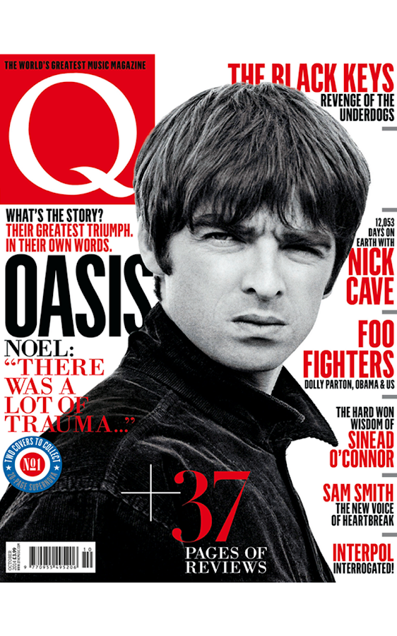
The location of the barcode, issue date and issue number will be found on the bottom right of the page because that is where it is conventionally found, such as on this magazine :

No comments:
Post a Comment