Tuesday, 21 February 2017

Pop Rock Research

In order to understand my genre more, which is pop rock, I must analyse a magazine that focuses purely on that genre, such as this:
 
 
This is the front cover for a pop rock magazine. The model, legendary guitarist Jimi Hendrix, is wearing a smart shirt and blazer. These are smart clothes and makes him look somewhat professional. This is what I was going for when I took photos of my model with a shirt and tie. In this image, Hendrix is in a suit with no tie and top button not done up, which shows he is smart but at the same time conveys his rugged, wild side. This is the same thing I did, as my model wore a shirt and tie but did not tuck in his shirt, which also shows he has a rugged, wild side to his character.
 
The masthead which says classic rock is covered by Hendrix' head which shows he is important and powerful. The masthead is red which has connotations of power and strength which reinforces the idea that he is a strong character.

Saturday, 18 February 2017

Thursday, 16 February 2017

My Photos


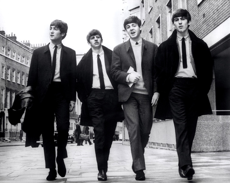
Here are the photos I have taken for my rock pop magazine. My model is in a white shirt and black tie because that is something typically worn by rock pop artists, in particular the Beatles:


Tuesday, 7 February 2017

Risk Assessment

Since I am taking my photos at home without supervision, I will need to compile a risk assessment to make sure I stay safe and minimise the risks that may occur as a result of shooting my photos.

The first risk is that I will walk into the road and therefore into oncoming traffic when shooting in the street. To minimise the chances of this happening I will make sure to look up and be careful whilst shooting photos on my camera.

Another risk is falling down whilst taking high angle shots of my model. In order to minimise this risk I will stand on a sturdy piece of furniture such as a chair.

Monday, 6 February 2017

Photography Plan / Synopsis

In order to make my magazine for the main task a step up in quality and detail from my preliminary task, I will take more professional photos. In my preliminary task I took photos on a whim because I had some free time and my friends were available. Some of them were even just images on my camera roll from months prior. However this time I will use a DSLR camera, in specifics the Nikon D3300, in order to have the best quality photos to use in my main task magazine product.

Seeing as my genre is  Pop / Rock, I will have to interpret the rock genre and include that in my photographic Mise en Scene. 

I will take photos this commencing week of a male teenager, my brother, to be specific. I will take the photos at home because I have a DSLR camera at home and I know how to use one efficiently, therefore I do not need the help of someone at college in the photography studio.

Because my genre is rock I will have my model standing with a vinyl record in one hand and a mobile phone in the other. This will be to signify the difference in music over the ages. The vinyl he will be holding will be of pop rock music, such as Bowie or the Beatles. I will turn the model into a rock & roll star, as that is what people will want to see on a front page of a magazine, a successful young singer that they can aspire to be. The story behind the images is that he is a famous, young rock singer that is talking to my magazine about the evolution of how people listen to pop rock music, hence why he is holding a vinyl and a mobile phone.

To show the genre of rock music I will incorporate a guitar into the shot. This is to show that it is a pop rock music magazine, as if it was a genre like techno or house, it would be a soundboard / keyboard. To reinforce the pop rock genre theme my model will wear clothing typically found in pop rock culture, such as the white shirt and black tie made famous by the Beatles:

Double page spread XXL analysis


Semiotic Analysis for XXL Double Page Spread

The main cvi of these pages are the two ladies pictured. They both show direct address, by staring straight into the camera, which shows rebellion and subverts dominant ideology that women are weak and powerless. This conveys a sense of power and pride, which creates a strong brand identity and appeals to women readers. Both females are also black which contradicts hegemonic values about race in modern day supposedly patriarchal society which some say favours white males, and here we have the binary opposite, two empowered black women.

The background colour is a solid white canvas which contrasts with the black text that lies upon it. The headlines are in red which have connotations of power, passion and strength, which reinforce the afore-mentioned ideals of the women being powerful and strong individuals. The red on the white show a contrast.

On the right hand page there is a pull quote at the top in black bold text which shows that it is important and needs to be seen. This shows that this is an important magazine and it appeals to its target audience as the boldness shows power and strength.

Sunday, 5 February 2017

My Own Magazine Decisions

For my own magazine, I have decided that I will base it around the music genre of Pop Rock. I have experience in understanding Rock music magazines, as I have analysed multiple aspects of UK Rock & Roll magazine such as it's target audience, front cover, contents page and double page spread. My survey results came back and Rock was voted once out of the 10 responses from my target audience. This shows that there is not a massive demand for rock magazines, however I know that there is a definite audience out there within my target audience demographic that will want one.

Therefore my magazine will be more alternative, such as the Louder Than War magazine. It will not be mainstream like the XXL magazine. My magazine will be aimed towards a niche, somewhat subjective audience that are very specific about their tastes, which in this case is rock music. Despite there not being a high demand for this genre, I will still include the codes and conventions of magazines that I have researched and analysed so far to show good knowledge of magazines.


Contents Page Analysis XXL

Semiotic Analysis of XXL Contents Pages


The first contents page is the A SIDE, which is essentially just the features, aka the contents that are only found in this issue of XXL, not the regulars every month, which are featured on the B SIDE contents page. The background and main colour of this page is black which has connotations of death, pain and mystery. The cvi centre of visual interest on this page is the rapper on the left of the page. His style, sunglasses and hairdo all point towards the assumption that this man is a part of the hip hop genre that this magazine is based around. This reinforces the genre and lets the audience know what theme the magazine they are reading is, in case they hadn't caught on from the front page's blatant hip hop vibe. The colour of the text on the right hand side of the page (the contents) is white which contrasts to the black background that it lies upon. The black and white colour palette of this page has suggests mystery and entices the reader to look further into the magazine.


Doing so would bring the reader to a further page, this one named B SIDE in which all the regulars, in this case departments, are shown. This is not conventional, as usually in magazines (such as UK Rock & Roll) the contents are all featured on the same page in the magazine, not spread out and split up into multiple separate pages. This unconventional aspect could show that this magazine is not as mainstream as previously thought. The background colour is red which has connotations of love, passion and violence. Violence has often been synonymous with hip hop music, as it was a centre point of riots in the 90's. In this case the CVI is a woman in a blue fur jacket. The fur jacket is similar to the fur jackets worn on the front page by the two rappers, therefore she is reinforcing the luxury, wealthy theme of the magazine.

The blue contrasts with the red, as blue has connotations of trust, wisdom and stereotypically in modern society - boys. A woman in a jacket meant for males shows defiance and rebellion which reflect the hip hop aspect of this magazine, which is famous for being popular amongst younger generations, those who especially in adolescent years are involved in defiance and rebellion.

The text is white like the A SIDE which reinforces the colour palette and in turn reinforces XXL's brand identity.

Front Page Analysis XXL Magazine


Semiotic Analysis of XXL Front Cover

This is the front cover / front page for XXL Worldwide. The CVI, the centre of visual interest is the main image of the two men standing in the centre of the page. They are two American rappers known as Young Thug and Gucci Mane. This is evident as their names are shown below in a cream capital font. This shows the audience that this genre of magazine is hip hop / rap. The couple are clad in fur coats and an abundance of jewellery around their necks and wrists which conveys how wealthy and successful they are. These are considered role models due to their success, therefore they are on the front page to show the young, impressionable audience to be like them. 

The masthead is the name of the magazine which is XXL, in white capital lettering enclosed in a red rectangular box, The second X and the majority of the L are hidden by the head of Young Thug. There are headlines on the right hand upper corner to show what is featured inside the magazine, to entice passers-by to read. The cream colour of text appears more than once on this front page, therefore it is clear that this gold/cream colour is part of XXL's colour palette, which is used again and again to reinforce their brand identity.

The barcode is in the bottom right corner which is its conventional place in most magazines, as that is where it was located in Louder Than War, MixMag, and UK Rock & Roll.

Saturday, 4 February 2017

XXL Target Audience Analysis


Target Audience Analysis for MixMag

Product Analysis

Price - £3.95

Advertisers - flysupply clothing, dutch masters cigars, backwoods cigars, colossal records, mauri shoes, jezign basketball shoes, shanpresents books, Leonte Jewelry, original generation clothing, dottie staxx singer, venomous composition album, divinityflows music group, grantham world media.

Content - Interviews with Gucci Mane & Young Thug, 85 rappers offer their thoughts on the late Tupac, Look back at Lil Kim, Interview with Rich Homie Quan, Interview with Rizwan Ahmed, Interview with Amber Diamond, Upcoming albums, Upcoming artists, Upcoming gigs.

Market Segmentation:

Demographic -  The two models on the front page (who are also artists featured in the magazine) are two successful rappers, which men reading the magazine will aspire to be like. Therefore it is presumable that this magazine is aimed at men. However it could be unisex and aimed at both genders, as it could be said that the two men on the front act as a point of attraction to lure women to the magazine as a sexual point of interest. Age ranges of 14-25, which is a youthful age bracket. This is because modern hip hop is most commonly listened to by the younger generations.

Geographic - It is clear that this magazine is not aimed towards strictly UK audiences, as it is named XXL WORLDWIDE, implying it is distributed around the globe. The two artists on the front; Gucci Mane and Young Thug are from Atlanta, Georgia, USA, therefore it is not aimed only to UK fans. Ergo, it is read by audiences all around the world, therefore it is a mainstream magazine.

Benefits - The target reader will read this magazine because they want to know more about the new and upcoming artists and albums from the hip hop and rap music community. They will learn about new gigs regarding the hip hop industry therefore they have benefited from reading it.

Psychographic - Presumably still in some kind of education, especially readers between the ages of 14-18, they found out about this magazine through friends of similar ages and societal groups.

Behaviouristic - Very mainstreamed audience compared to Louder Than War and UK Rock & Roll. Like to spend time with friends and listen to the hip hop / rap genre of music in their spare time. Aspire to be rappers and / or be successful like the rappers featured on the front cover and throughout the contents of the magazine itself. Encourage eachother in their groups to listen to this music and in turn encourage one another to become successful like the rappers in the magazine.

XXL Magazine Brand Eye

In order to produce a quality end product for my main task, I must research another magazine and understand it's codes and conventions. I will analyse XXL magazine, its genre being Hip Hop / Rap.


Friday, 3 February 2017

Double Page Spread Analysis for UK Rock & Roll


Double Page Spread Semiotic Analysis for UK Rock & Roll

This is the double page spread for UK Rock & Roll, which features the female singer found on the front cover, which shows that this page is the main feature of the magazine. This is a convention found in magazines. The evident colour scheme for these pages are red white and blue, as they are found on the masthead and surrounding decoration. This tri-colour palette is synonymous with Great Britain as the Union Flag is made up of these three colours. This is used as this magazine is aimed at those in the UK, and it creates a sense of patriotism among the readers and unites those among the rock & roll community.

The picture on the left is of a man singing with back up artists. The caption in the top right corner of the image in white text tells me that these people are called "Cherry Casino and the Gamblers". This is a rock & roll group, as that is the genre of this magazine. This reinforces the genre and shows that this magazine is primarily aimed towards those who like Rock & Roll. The body of text beneath this image is black non-serif text on a white background, a recurring theme found on the contents page of the same magazine. This copy of text begins with a drop cap of a "T" in large, bold, serif, blue font. This reinforces the colour palette and in turn the magazine's brand identity.

The image opposite is of Rhythm Shakers, a band found on the front page, which shows that this is the main features of this issue of UK Rock & Roll.

Uk Rock & Roll Contents page analysis


Semiotic Analysis for the contents page of UK Rock and Roll

This is the contents page. The contents section itself is only located in the top left hand corner of the page, which is simplistic and minimalist to show that this magazine focuses on the bigger picture, literally speaking, as there is a large picture to the right. The contents themselves are in non-serif black italic text. The background for this section is white, therefore the black on white creates a visual contrast and makes it easier for the audience to read.

The title of this section is in bold italic serif font which shows that this title is more important than the rest of the contents. It is underlined to emphasise its importance on the page. Above this is the facebook page link for the magazine, in order to promote exchange and get the audience to react to the magazine in an easier way online, which in turn helps reinforce their brand identity. 

Below the contents section is a rectangle that features information for how to subscribe to the magazine and never miss an issue, which serves to help more people subscribe, which in turn gives the magazine (and their publishers, Silverback Publishing) more money.

The majority of this page is the editorial letter, from Johnny Hop, the editor. The writing is in white text which contrasts with the black and also contrasts with the black on white text combination featured on the left hand side of the page. Some of the writing, such as the subheadings (The Rant, The Funny Story) are in red font colour which is also featured on the masthead which is the title of the magazine found on the front cover and at the top of this page. This is the magazine's colour palette which helps to reinforce UK Rock & Roll's brand identity. The picture on this page is of three somewhat older men in suits singing. This reinforces the genre of the magazine, which is Rock and Roll, as these suits are synonymous with vintage Rock & Roll - it reminds the audience what magazine they are reading.

Thursday, 2 February 2017

Front Cover Analysis : UK Rock & Roll


UK Rock & Roll : Front Cover Semiotic Analysis
This page is the front cover for UK Rock & Roll Issue 153 for January 2017. The CVI here is the large image in the centre that dominates the page. It features a woman singing into a microphone. The use of the microphone and her open mouth reinforce the genre, which is music. Below her is an ornately bordered white box that says "A case of the shakes" which is a play on words, as the band she is in is called "Rhythm Shakers".
The masthead is the title of the magazine, which in this case is "UK Rock & Roll". It is at the top centre of the page, which is the conventional place for mastheads to go on magazines, as this is where it was found on Louder Than War and MixMag. The font is serif and grand. "Rock" and "Roll" are in large black text, whereas the "UK" and "&" are in red. Therefore black and red are the two colours that UK Rock and Roll use in their colour palette, used to create and reinforce brand identity.
The background is a pattern of leaves, roses and crosses, in red, green and black colours on a cream canvas. This is an unusual and unconventional choice of background, as the cover of MixMag was a simple black solid colour background. This pattern is synonymous with the elderly, as it is quaint, which suggests it is aimed at older generations. However, these designs look like those that are used as tattoos, which then suggest it is aimed at the more younger-middle aged generation, that have tattoos. The background of tattoos relate to the tattoos on the woman in the centre's arm.
The banner and barcode are in the bottom right corner, which is its conventional place, as this is where they were placed on Louder Than War and also on MixMag.

Wednesday, 1 February 2017

UK Rock & Roll target audience analysis

Target Audience Analysis for UK Rock & Roll

Product Analysis

Price - £3.60

Advertisers - The big jive all day concert, The rockabilly rave concert, Ozone clothing, Prison blues jeans, The hot rod hayride, Bournemouth and Blackpool Rock & Roll weekend, 34th Annual Rockers Reunion Winter Party, Ultimate 1950's rock and roll weekend 2017, Holiday rock events, Hemsby 58 festival, Shake Rattle and Roll festival, Gene Vincent tribute night, Viva Las Vegas rockabilly weekend.

Content - Charts, Bettajive Review, Fashion, Rockin' Instrumentals, Gig guide, Psychobilly corner.

Market Segmentation:

Demographic - Rock N Roll is a typically male music genre, as the majority of artists are male. However this dominant ideology is subverted by the feature of a woman on the front cover, which serves to announce up-front that this isn't aimed just for men, but women as well. The genre itself goes back decades, therefore it is aimed at the older generation as well as the younger. Rock and Roll was only voted for once in my magazine survey, which was aimed at 13-24 year olds, therefore clearly showing it is not terribly popular among those in the younger age brackets.
Geographic - This magazine is very clearly aimed primarily at those residing in the UK, as the name of the magazine itself is "UK Rock & Roll", implying it is aimed at UK residents. The UK target audience idea is reinforced by the banner in its conventional location in the bottom right of the front page, I say conventional place because that is where it was on the two previous magazine I analysed; Louder Than War and MixMag. This is because the banner shows the price only as £3.60, the £ representing GBP, which is sterling only used in the UK, therefore it is not distributed in the USA, as the prices would include $ USD.
Benefits - The ideal consumer would read this magazine because they want to know more, or add to their already established knowledge, of the Rock & Roll music genre. The target reader would benefit from the charts section, because they will learn of the best albums in the community to listen to, which they will undoubtedly want to because that is the genre that they enjoy.
Psychographic - Probably of an older age, presumably around 30-40 years of age. The type of people interested in music that is decades old, such as rock & roll. This shows that they have traditional tastes. Seeing as they are presumably 30+ they probably have their own house, with a solid salary income source.

Behaviouristic - A somewhat mainstream audience, more mainstream than those for Louder Than War and MixMag. They enjoy learning about upcoming gigs, suggesting they have interesting and outgoing social lives.

Brand Eye for UK Rock And Roll

 
This is the brand eye target audience analysis for another magazine I am researching : UK Rock & Roll.