Friday 31 March 2017

Evaluation

I will begin to evaluate my main task over the coming days and weeks to round off my project so far.

The questions that I will be answering and discussing include;


  • In what ways does your media product use, develop or challenge forms and conventions of real media products?
  • How does your media product represent particular social groups?
  • What kind of media institution might distribute your media product and why?
  • Who would be the audience for your media product?
  • How did you attract / address your audience?
  • What have you learnt about technologies from the process of constructing this product?
  • Looking back at your preliminary task, what do you feel you have learnt in the progression from it to the full product?
Seeing as the evaluation is a creative task, I will try to present mine in different, interesting ways. These include, prezi, podcasts, screen recording software etc.

Sunday 26 March 2017

Pictures used

This is a contact sheet made up of all the pictures I shot that I would use for my contents page.

Thursday 23 March 2017

House style for Anthem


I have decided that my colour scheme will be red, black and white. The red has connotations of power, passion and courage. With my magazine I aim to express passion, in this case a passion for pop rock music. The red, black and white colour palette is reflective of Q magazine, which is known for its iconic red black and white colours used. Q is also a pop rock music magazine, therefore this shows that this colour scheme will appeal to the pop rock target audience, as I know that Q is successful.
 
 
I will not have a logo as such, but instead a powerful and iconic "ANTHEM" masthead in either red or white text, the font of which will be Haettenschweiler as that is a powerful and dominant font style which is helpful as I am aiming to convey power with my magazine, as the people reading it will want to achieve some sort of power within their lives.
 
The location of the barcode, issue date and issue number will be found on the bottom right of the page because that is where it is conventionally found, such as on this magazine :


Tuesday 21 March 2017

Contents Page Design

I am currently designing my contents page, and I want it to contain a line at the top with the name of my magazine, Anthem, to feature somewhere along the line. This is to take inspiration from this magazine:
 
 Here is the first design of the line at the top,
 
 
However, I have decided to use this line and masthead combo as the red stands out more.
 

Thursday 16 March 2017

Magazine Name

I have decided to name my magazine: ANTHEM .

This is because anthem is synonymous with music, and my magazine is a music magazine. More specifically my magazine is based on pop rock music, and anthems are common with rock songs and concerts. Anthems are used in big stadiums and venues in rock concerts or sports games, and they are powerful. Everyone joins into the anthems and chants together which creates a sense of community and togetherness. This is what I am attempting to create with my magazine, a powerful sense of community, which brings all the fans of pop music and rock music, together.

Tuesday 14 March 2017

Front cover decisions

 
This front cover has anthem in red which is conventional in pop rock magazines, as red has connotations of passion, anger etc. The masthead is pushed to the upper left hand side because that is where mastheads are conventionally found on magazine covers, and this is a good place to put it as it is where the human eye is naturally drawn to.
 

However, this is the front page I will be going with because it subverts typical front page stereotypes. This sets the tone of the magazine, that it is different and doesn't follow the crowd, which is something that my target audience will aspire to do. The white masthead stands out more than the red one which draws the eye to the page more than the red does. The image is pushed over to the left which makes it more interesting to look at, and holds the audience's attention for longer than it would have been has it been centred like in the first picture.

Sunday 12 March 2017


My Pop Rock magazine Target Audience Analysis
 
Audience Profile
 
Gender : Unisex
 
Age : 15-30 year olds
 
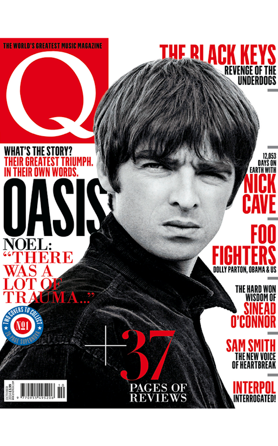
Clothes they wear : Pop Rock isn't as expressive a genre as say punk rock or indie music, therefore the clothes are average and somewhat mainstream, such as t shirts and jeans. The model on the front cover is wearing a shirt and tie to reflect the older pop rock era such as the Beatles. The fact that the shirt has a tie and is done all the way up conveys eloquence and a smart vibe. However the shirt is untucked which also shows a rebellious side, and that not everything is as it seems which is synonymous with pop rock music. Pop rock is the balance between the jovial innocence of pop and the rebellious extroversion of rock music.
 
Jobs they have : Seeing as the target age demographic is 15-30, a small percentage will be 15-18 and may be in full time education, therefore they may have part time jobs such as retail or stock room. The majority of the target audience however are over 18 and therefore presumably in a job full time, and seeing as this genre is somewhat mainstream and not niche, the audience will have normal, average jobs such as teachers, nurses, retail workers etc.
 
Market Segmentation
 
Demographic : The age range is 15-30 therefore they are of a young age and will presumably have busy, time consuming social lives. This means that this magazine will be read when they are enjoying a brief stint of free time within their hectic timetable.
 
Geographic : Due to the audience not being niche and alternative (which would suggest a catchment area of trendy locations such as Camden, Shoreditch, and Hackney) the areas in which they live will be average and normal such as Manchester, London, Birmingham, Newcastle etc. The mainstreamed genre is the most played on modern radio, therefore there will be an abundance of fans in every city or town in the UK.
 
Psychographic : These audience members will presumably be avid clubbers and drinkers due to their young age. However also because of their young age they may be somewhat tight with money as traditionally young people don't have lots of money as they have not been working as long as people 2-3 decades their senior.

Behavioristic : Mainstreamed audience that listen to pop rock music everyday. May also listen to other genres such as indie and punk. Want to be successful but in their own fields, not necessarily aiming to develop a fruitful career in the pop rock music industry.


Friday 10 March 2017

Image Manipulation

In order to get my images ready for placing on the magazine document in InDesign, I have used photoshop to edit them. This involves cropping out the image of the model, as well as applying levels to adjust the exposure to an appropriate level.


Thursday 2 March 2017

Ideas for photos

I have taken the main chunk of photos for my magazine, ones which will be featured on my front page and double page spread, therefore I still need some to be featured on my contents page. In order to relate to the genre, my images will have young people in typical young people clothes like jumpers and jeans, to show that they are young. However, I will have them wear smart clothes on top like suit jackets etc to show they are also involved with Rock n Roll / Pop music.